Improving web usability for addiction and mental health services

Improving web usability for addiction and mental health services

Role:

UX, Usability Research

Period:

Aug 2021 - Mar 2022

Type:

Voluntary

Collaborators:

Jade Bryne (UI & Content Designer), Natalie (Senior Director of PHCA)

Skills:

Project management, UX research, Usability Evaluation, Information Architecture

Industry:

Healthcare, Addiction treatment and mental health services

Introduction

Phoenix Houses of California is the leading nonprofit for treating substance use and mental health disorders

Phoenix Houses of California is the leading nonprofit for treating substance use and mental health disorders

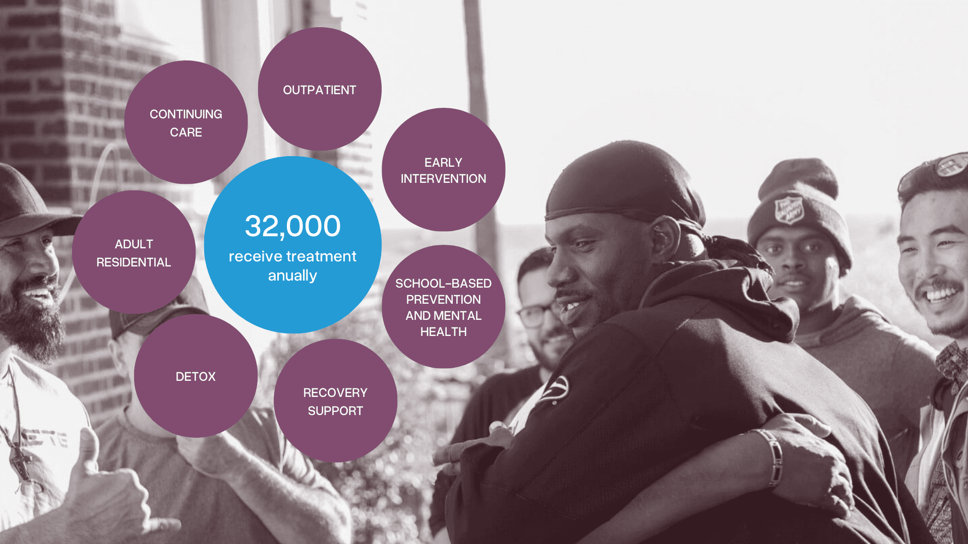
Phoenix House California (PHCA), is a leading nonprofit treating substance use and mental health disorders for over 32,000 individuals annually across multiple Southern California locations.

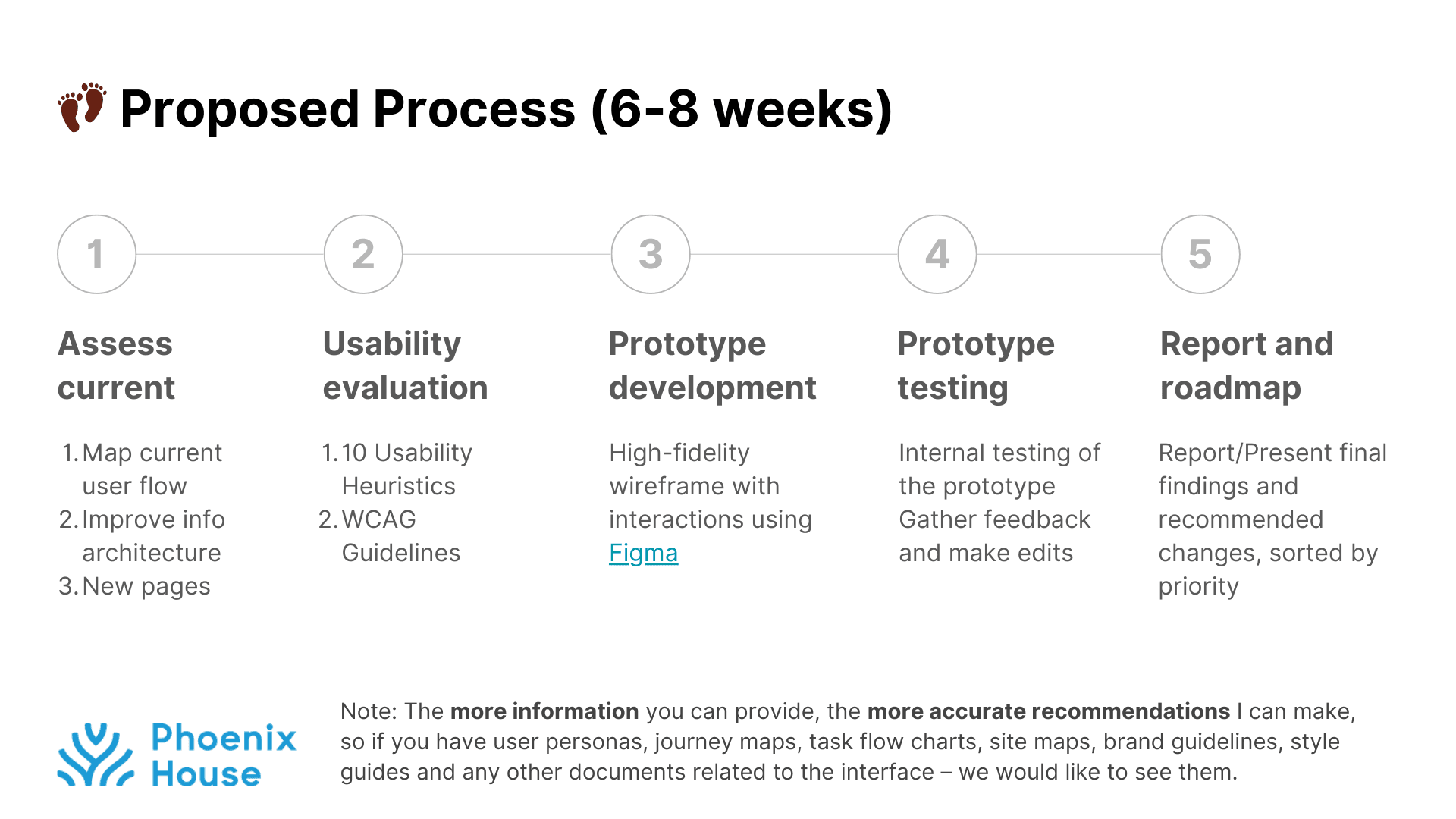
In Aug 2021, I responded to Phoenix Houses of California (PHCA)'s call for volunteers to improve their website usability with the following scope and timeline proposed.


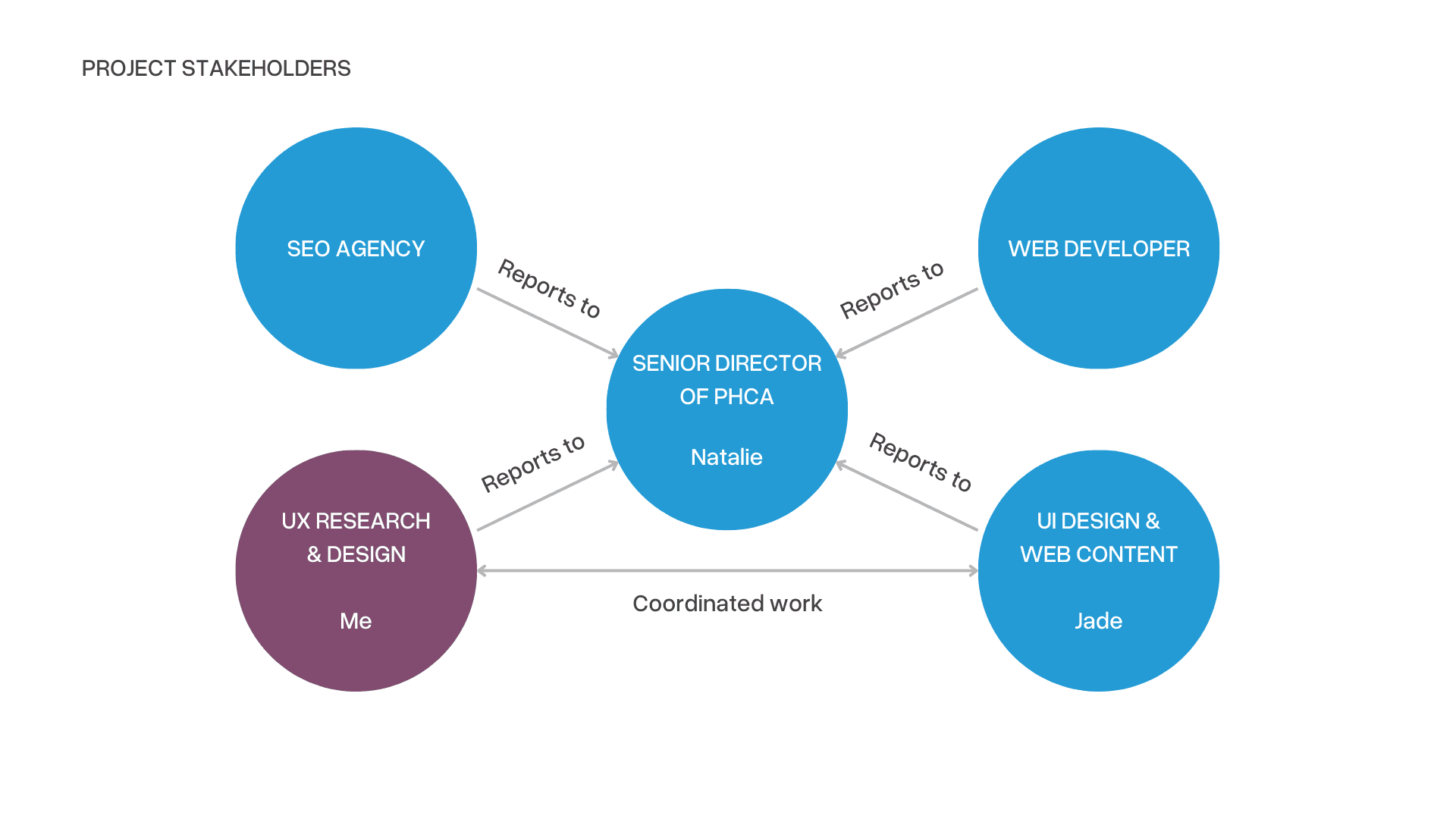
I collaborated remotely alongside PHCA’s Senior Director, Natalie, and UI/UX designer, Jade Bryne.

Problem

Poor Accessibility and Goal Completion Barriers

Poor Accessibility and Goal Completion Barriers

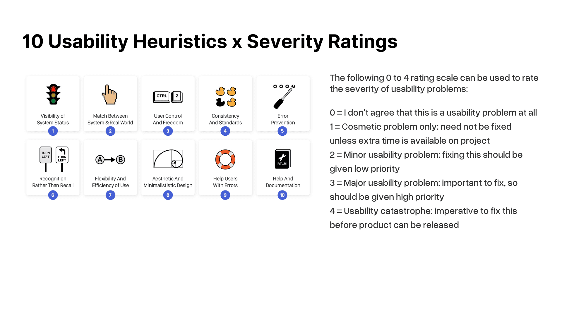
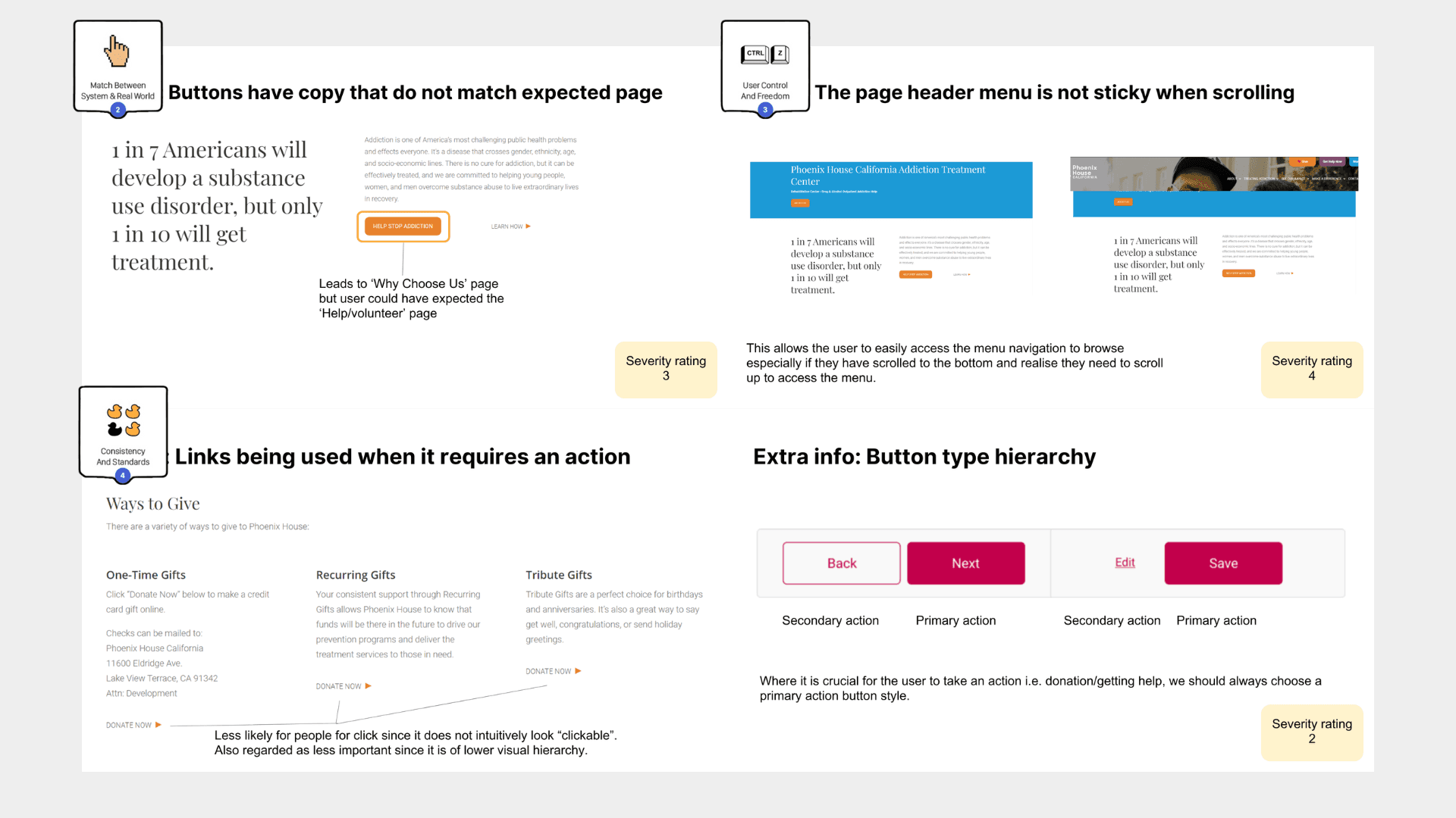
I first analyzed PHCA’s website with Jakob Nielsen’s Usability Heuristics. It is reliable as a baseline measure for audits. I combined this evaluation with a ranking framework by Jakob Nielsen to prioritise the severity of the usability problems identified.

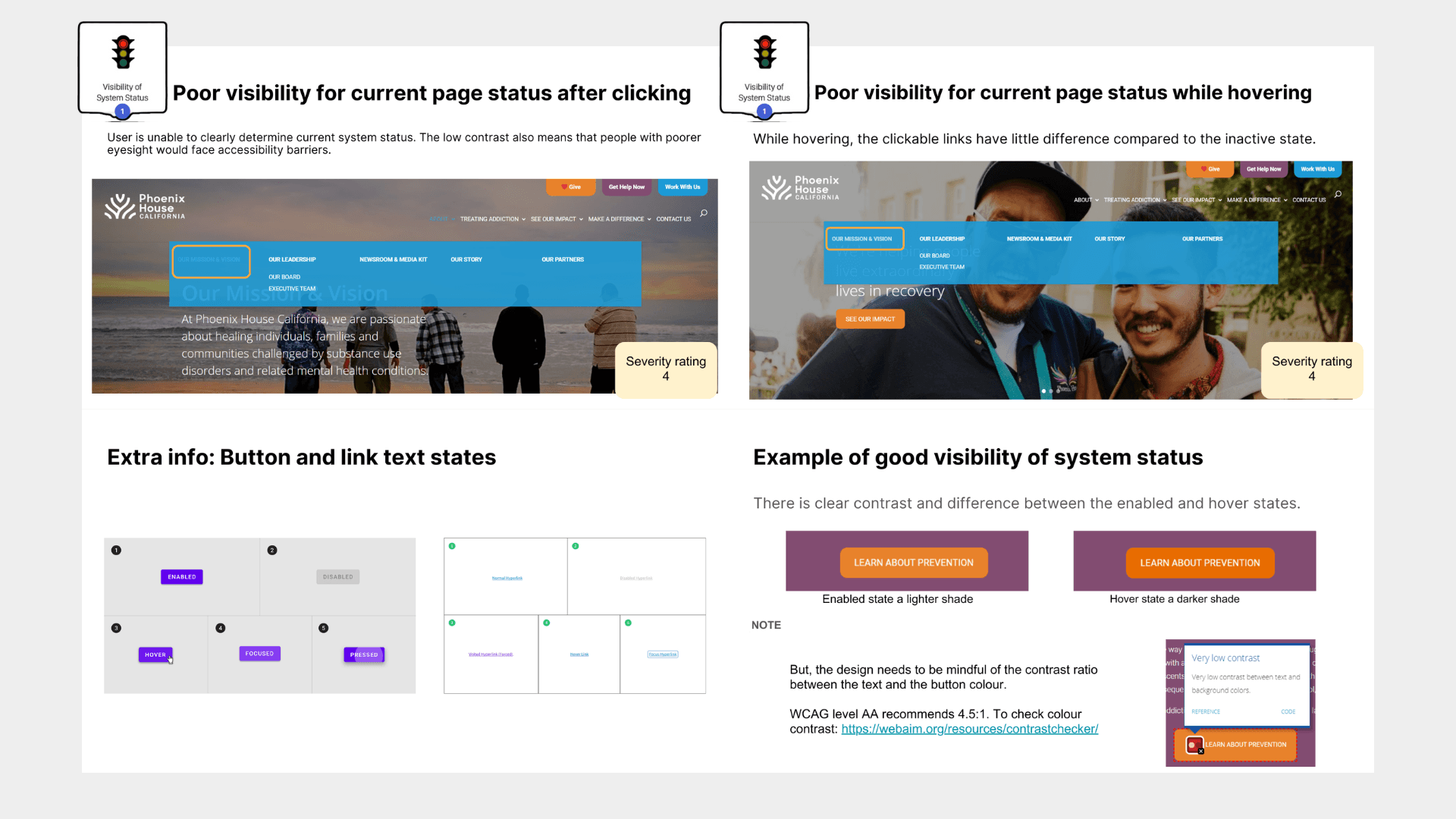
This led to finding these significant usability issues:

Goal Completion Barries

• The navigation were potentially unclear for target users.

• Key Call-To-Action buttons, such as contacting PHCA or donating, were buried and hard to find.

Poor Accessibility

• Poor color contrast that did not meet WCAG guidelines made it difficult for some users to interact with the site.


PHCA's Heuristic Evaluation Violations


Business context

Ensuring Compliance and Expanding Access Through Accessibility

Ensuring Compliance and Expanding Access Through Accessibility

As a 501(c)(3) nonprofit operating in California, PHCA must comply with federal accessibility requirements under the ADA and state laws like the Unruh Civil Rights Act and AB 1757.

Noncompliance risks legal challenges and limits access to critical resources for individuals with disabilities. This risk makes it critical for PHCA to improve their usability.

research

Contextualising usability issues with actual user needs and goals

Contextualising usability issues with actual user needs and goals

While Jakob Nielsen’s Usability Heuristics was useful as a quick and low cost way to audit usability, I still had to complement that insight with actual user behaviours on PHCA's website.

I used a combination of research methods:

1. Identified three user types and their goals through Empathy Mapping

I workshopped with Natalie, and uncovered three core user personas : at-risk youths, parents/teachers, and volunteers.


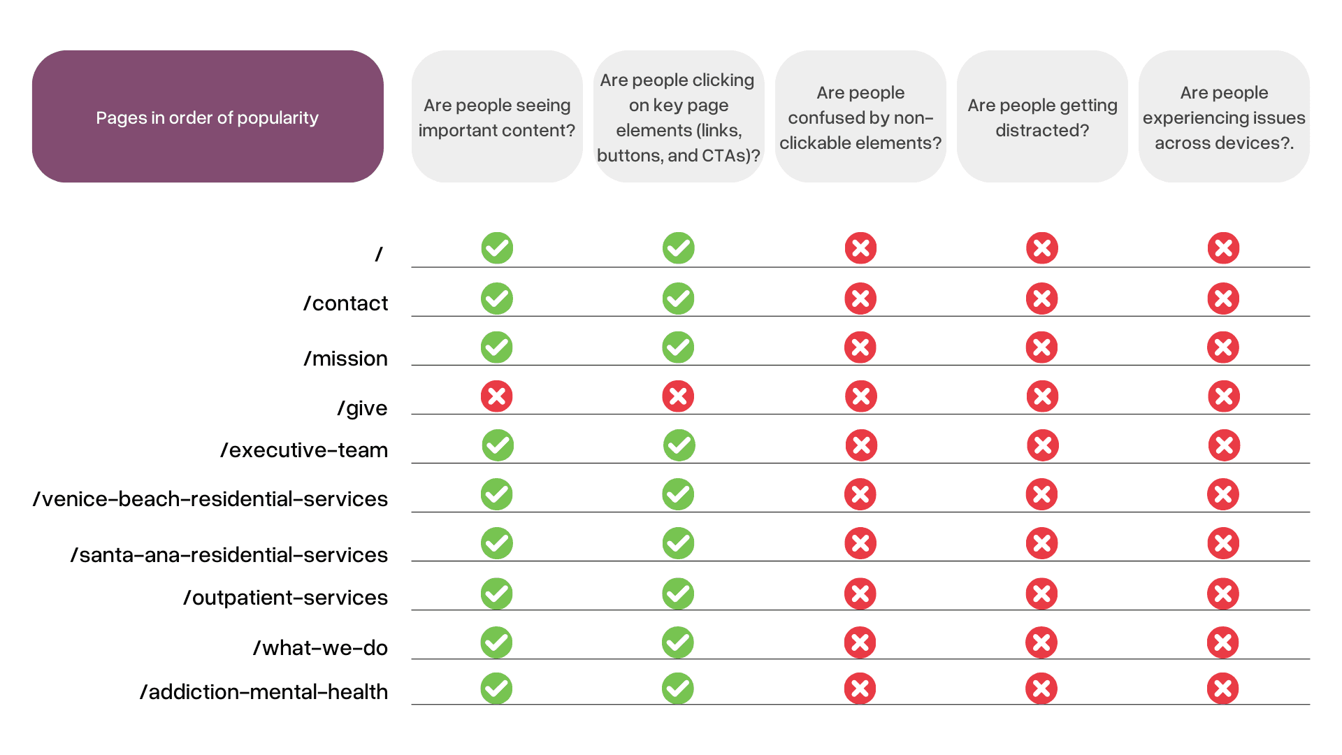
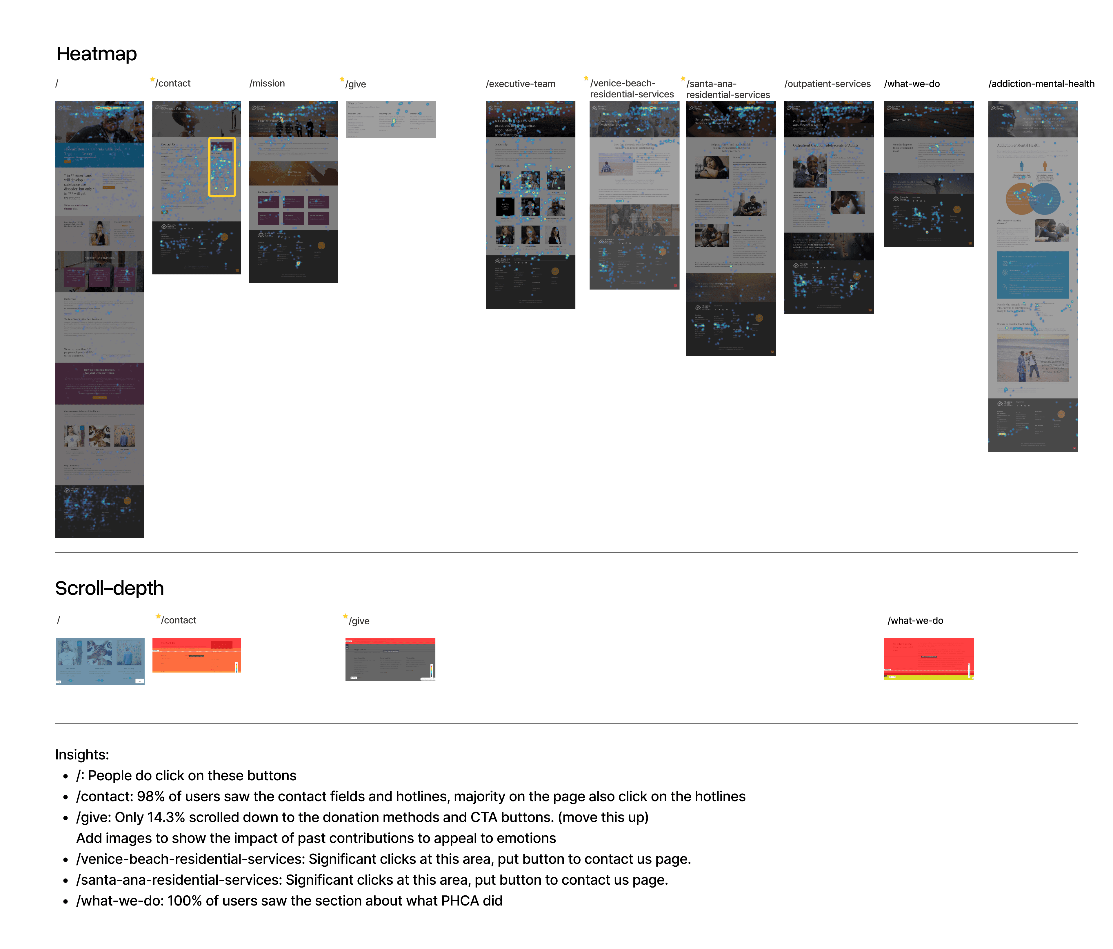
2. Uncovered webpage interactions through Heatmap Analysis

3. Accessibility Audit

I used WebAIM’s Chrome extension to identify accessibility issues, such as poor color contrast in the navigation bar.


Framing the opportunity

Fixing usability gaps that impact users' journey and goal completion

Fixing usability gaps that impact users' journey and goal completion

Design Direction

Improving Information Architecture and Visual Design to improve accessibility

Improving Information Architecture and Visual Design to improve accessibility

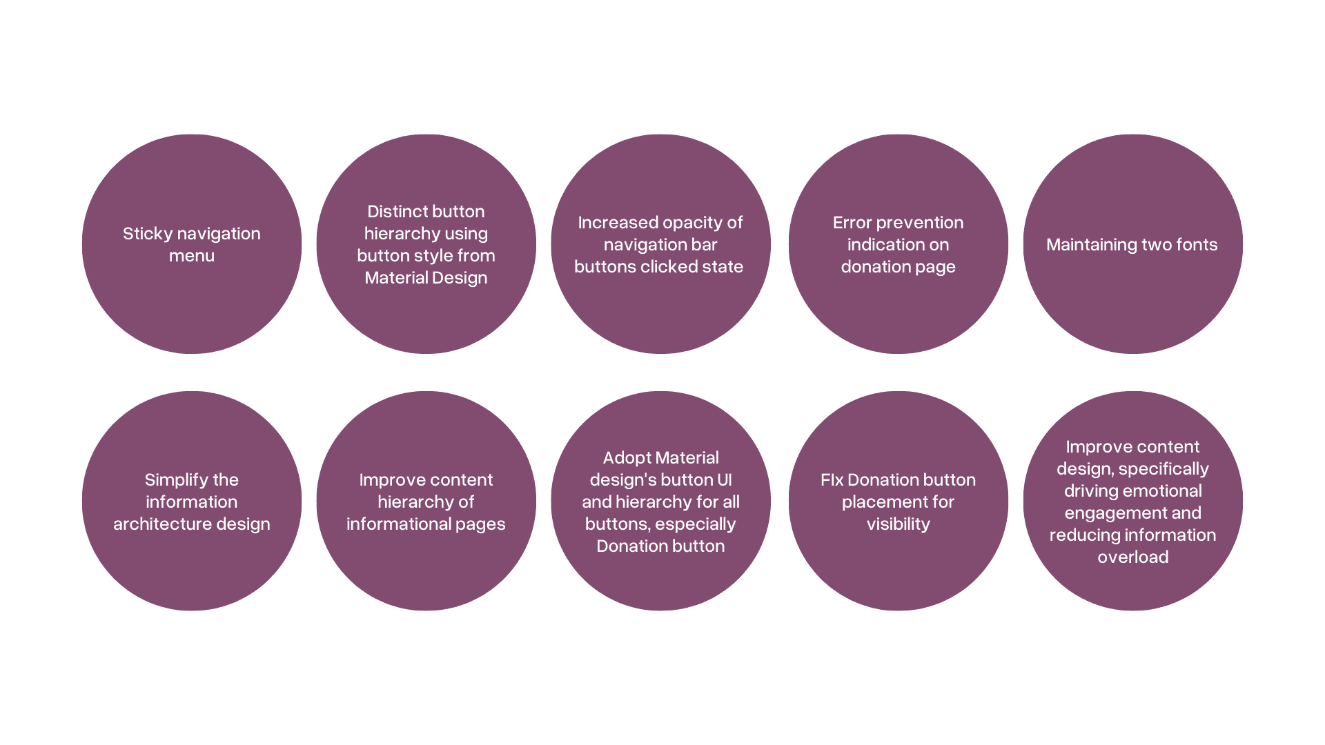
Through a joint meeting over Zoom with Natalie and Jade, we decided on the design changes that we would fix:

Through a joint meeting over Zoom with Natalie and Jade, we decided on the design changes that we would fix:

Final outcome

Final Designs and Outcomes

Final Designs and Outcomes

I designed the following concepts, and handed it off to Natalie:

1. Simplified Information Architecture

Before


After
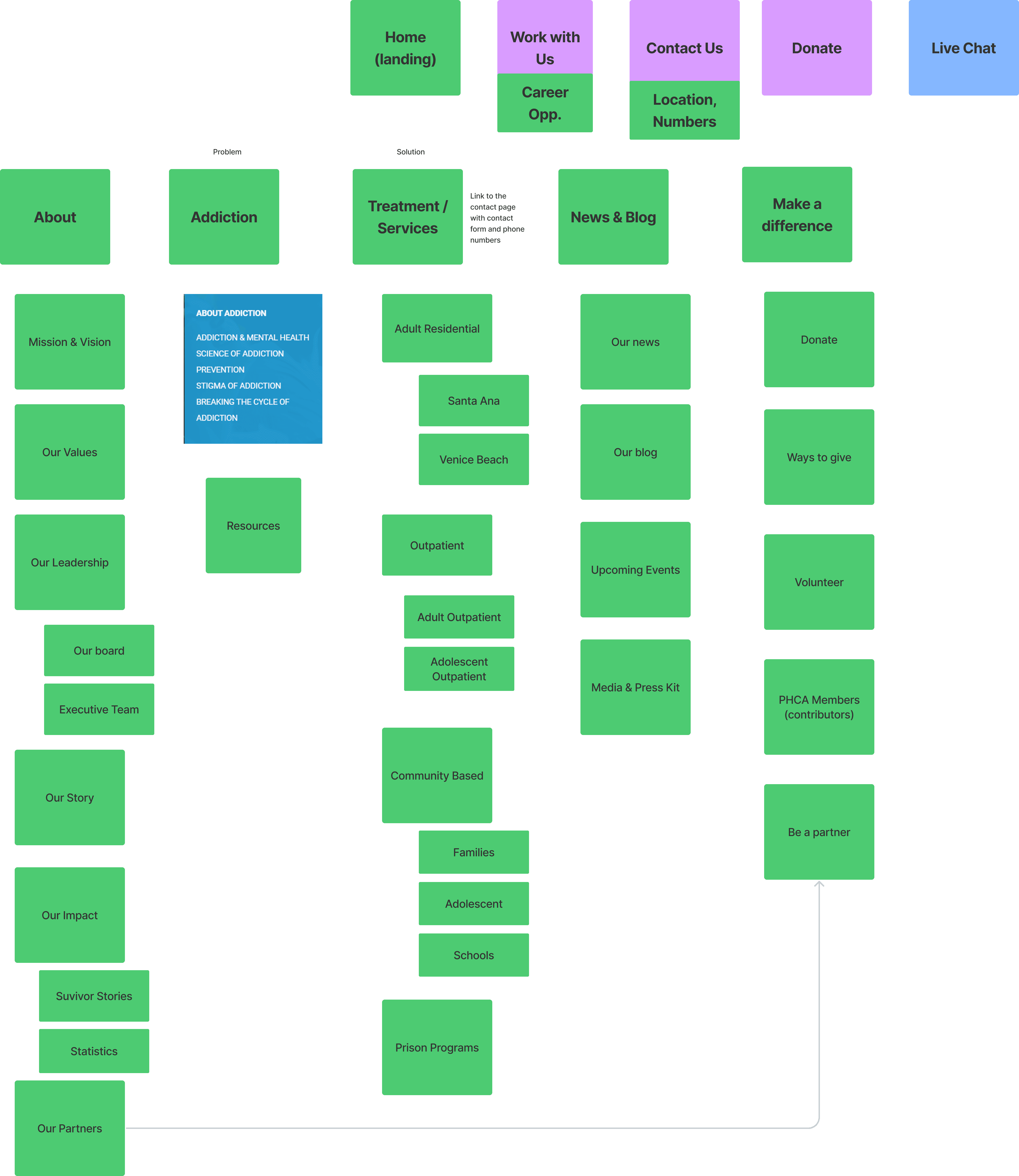

2. Sticky Navigation Menu, Donation Button Visibility


3. Improved Button Hierarchy, Donation Button Visibility, Call-To-Action Visibility & Contrast
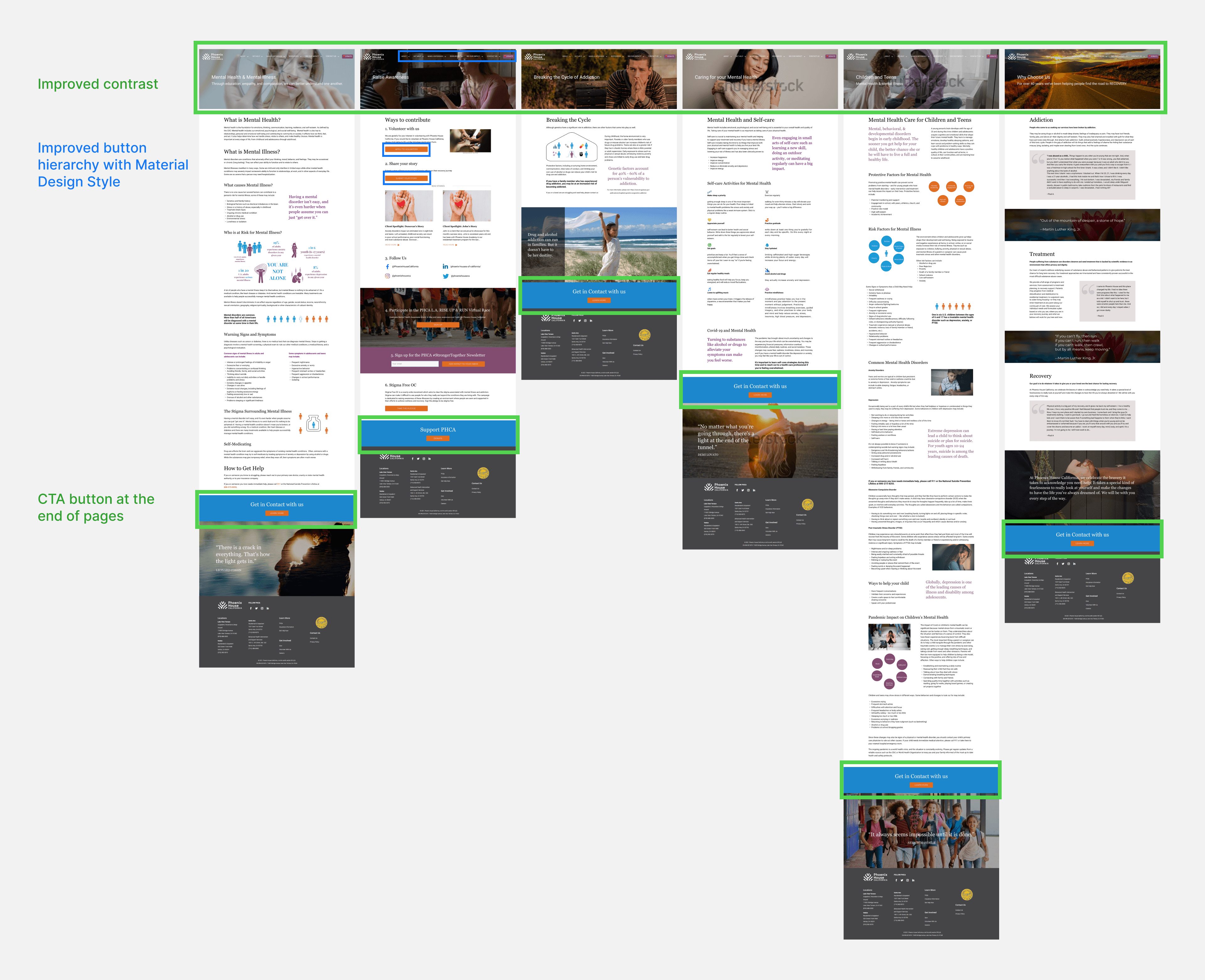


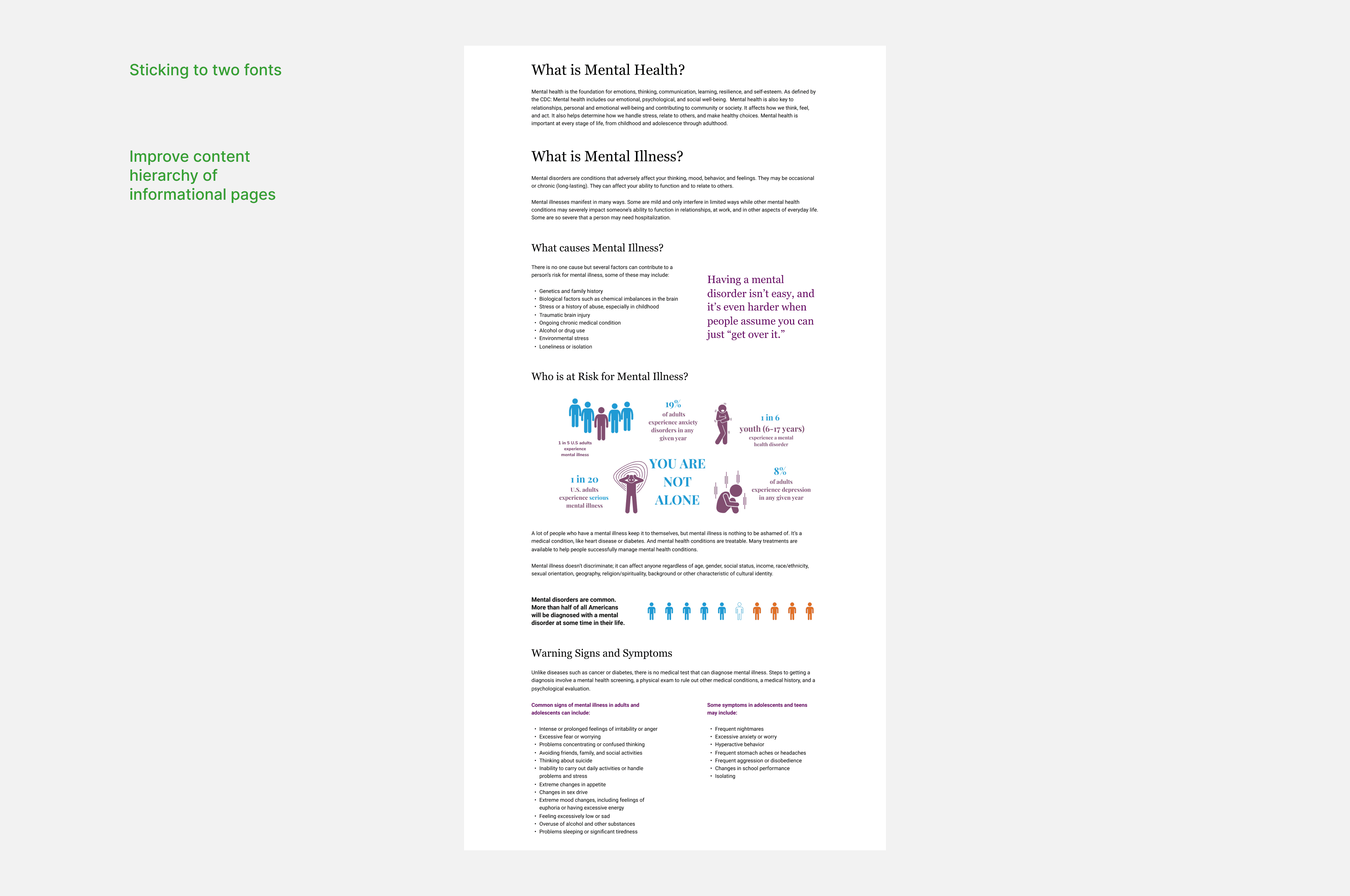
4. Maintaining two fonts & improved content design

Learnings

Reflections and learnings

Reflections and learnings

If there were more time was given for the project, I would have liked to:

  • Recruit users via surveys to run usability tests and observing the challenges and ease of completing goals.

  • Leverage design communities to recruit evaluators improve the heuristic evaluation.

  • Use the paid feature of Hotjar to uncover the user journey of web users.

When working with clients, it was important to:

  • Establish trust right from the get go; I believe that the project went smoothly in large due to the commitment, transparency and agency established between the organisation and myself

Copyright © 2024 Huei Suen

Copyright © 2024 Huei Suen